The Psychology of Advertising Signs: How They Were Designed to Sell
Vintage advertising signs aren’t just decorative relics; they’re fascinating windows into the persuasive techniques of the past. Understanding the psychology behind their design reveals a deliberate effort to capture attention, evoke desire, and ultimately, convince consumers to buy a product. This article explores the key psychological principles employed by advertisers in creating these compelling pieces of antique advertising.
The Power of Color and Visuals
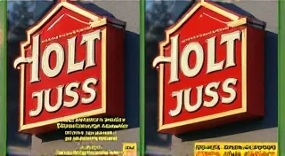
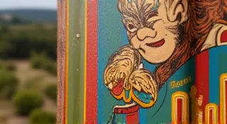
Color psychology played a crucial role in sign design. Bright, bold colors like red, yellow, and blue were often used because they’re eye-catching and quickly grab attention, even from a distance. These colors evoke different emotions too. Red, for example, signifies excitement and urgency, while yellow conveys optimism and cheerfulness. Advertisers carefully selected colors to align with the product's image and intended feeling. The use of compelling imagery was equally important. Signs featuring idealized versions of people, idyllic scenes, or even anthropomorphic animals were designed to create an emotional connection with the viewer and associate those positive feelings with the advertised product. Consider, for example, the vibrant hues often seen on signs advertising automotive products – a deliberate choice to reflect speed, prosperity, and the open road. If you’re interested in exploring that era further, you might find the golden age of automotive advertising signs particularly enlightening.

The Role of Association and Storytelling
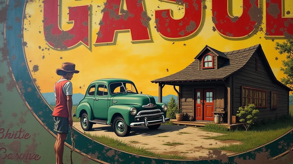
Advertising signs weren’t just about displaying a logo and a price. They often told a story, creating a narrative that tied the product to a desirable lifestyle. A sign advertising automobiles might depict a stylish couple embarking on a scenic road trip, suggesting that owning the car would lead to adventure and freedom. Product placement within a relevant setting – a farmer using a specific brand of fertilizer, for example – helped to normalize and endorse the product’s effectiveness. The clever use of humor and catchy slogans further cemented the product in the viewer's mind. This storytelling element extended beyond cars, influencing advertisements for everything from beverages to household goods. The goal was to weave the product into the fabric of the consumer's aspirations, making it a symbol of a richer, more fulfilling life.
Leveraging Gestalt Principles
Advertisers were often subconsciously (or consciously!) employing principles of Gestalt psychology. Gestalt principles describe how our brains organize visual information into meaningful groups. For instance, the principle of proximity – grouping elements close together – was used to create a sense of unity and make the sign easier to understand at a glance. The principle of closure – where our minds fill in missing information – was utilized to create visual intrigue and draw the viewer in. The visual hierarchy, guiding the eye to the most important element first, was a crucial aspect of effective sign design. Think about how a brewer might use these principles in advertising – carefully positioning elements to create a sense of completeness and quality that subtly communicates the product’s desirability.
Typography and Readability
The choice of typeface was more than just aesthetic. Bold, easily readable fonts were crucial for attracting attention and ensuring that the message could be quickly understood, even from a distance. Elaborate, decorative fonts might be beautiful, but they weren’t always practical for advertising. The strategic use of font size and placement contributed significantly to the overall impact of the sign. Designers carefully considered how the text would appear from afar, accounting for factors like speed of traffic. This attention to detail extended to all aspects of the design process, ensuring that the sign effectively communicated its message to a broad audience. The careful selection of imagery and typography were part of a holistic approach to persuasive design. And if you’re looking to understand the appeal of vintage collectibles, you might also want to consider the art of reproduction signs and what to look for in authentic examples impacts their overall value.
The Enduring Appeal of Vintage Advertising
Today, vintage advertising signs are highly sought-after collectibles. Their appeal isn't just about their historical significance; it's also about the artistry and psychological ingenuity that went into their creation. They offer a unique glimpse into a bygone era of marketing, reminding us of the powerful influence of visual persuasion and the enduring quest to connect with consumers on an emotional level. Appreciating the psychology behind these signs enriches our understanding and enjoyment of these fascinating pieces of antique advertising.
The value of these signs extends beyond their monetary worth. They serve as tangible links to the past, providing insights into the social, economic, and cultural trends of the time. Analyzing their design elements allows us to understand the values and aspirations of previous generations. For instance, the prevalence of signs promoting specific brands reveals the growing importance of consumerism and branding in the 20th century. Furthermore, the evolution of advertising signs reflects the technological advancements of the era, from the hand-painted signs of the early 20th century to the mass-produced signs of the later decades.
The craftsmanship evident in many vintage signs is also a significant factor in their appeal. The intricate details and vibrant colors often resulted from painstaking manual labor, a stark contrast to the often-automated production methods of today. This level of artistry and attention to detail is a testament to the skill and dedication of the sign makers, whose contributions are often overlooked in the larger narrative of advertising history.
Deeper Dive: The Psychology Behind Specific Sign Elements
Let's examine some key elements of vintage advertising signs and how they tapped into the human psyche. The use of idealized imagery, for example, was a cornerstone of the advertising strategy. People were presented with visions of perfect families, successful careers, and idyllic lifestyles, all seemingly attainable through the purchase of a specific product. This created a sense of desire and aspiration, motivating consumers to strive for a better life.
The strategic use of scarcity and urgency also played a crucial role. Limited-time offers, exclusive deals, and the suggestion that products were in high demand created a sense of pressure to buy now rather than later. This tactic, known as the “fear of missing out” (FOMO), is still widely used in advertising today.
Furthermore, advertisers often appealed to emotions such as nostalgia, patriotism, and community. Signs promoting local businesses or showcasing traditional values fostered a sense of connection and loyalty among consumers.
Spotting Authentic Vintage Signs – and Avoiding Fakes
With the rising popularity of vintage advertising signs, the market has also seen an increase in reproduction signs. These fakes are often designed to mimic the appearance of authentic signs, making it difficult for even experienced collectors to distinguish them from the real thing.
Careful examination of the materials, paint techniques, and typography is essential for identifying authentic signs. Authentic signs often exhibit signs of age and wear, such as fading, chipping, and rust. Reproduction signs, on the other hand, are often pristine and lack the characteristic imperfections of age.
Researching the history of a specific sign and comparing it to known examples is also crucial. Consulting with experienced collectors and experts can provide valuable insights and help avoid costly mistakes.
The Future of Vintage Advertising Sign Collecting
The collecting of vintage advertising signs is likely to remain a popular hobby for years to come. The allure of these pieces lies not only in their aesthetic appeal but also in their ability to transport us back to a different era. As more people become interested in preserving and celebrating the history of advertising, the value and appreciation for these unique pieces of Americana will only continue to grow.